Unlock Professional Color Combinations Using the Color Wheel
Discover how to make your Cricut projects pop with perfectly paired colors. From tints and shades to complementary and triadic palettes, this step-by-step guide will teach you how to use color theory inside Cricut Design Space like a pro.
Why Color Matters in Cricut Crafting
Color isn’t just about beauty—it’s about emotion, balance, and visual impact. In the world of Cricut crafting, understanding how to choose and apply color can transform an ordinary design into a masterpiece. Whether you're designing cards, wall art, or vinyl decals, the right color palette will make all the difference.
🌀 The Color Theory Breakdown (Made Easy)
Here’s how to break down and apply the fundamentals of color theory in your Cricut projects:
🎯 Step-by-Step: How to Use Color Like a Pro in Cricut Design Space
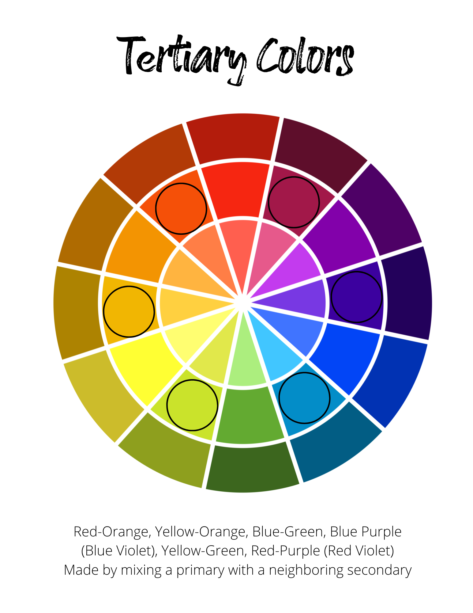
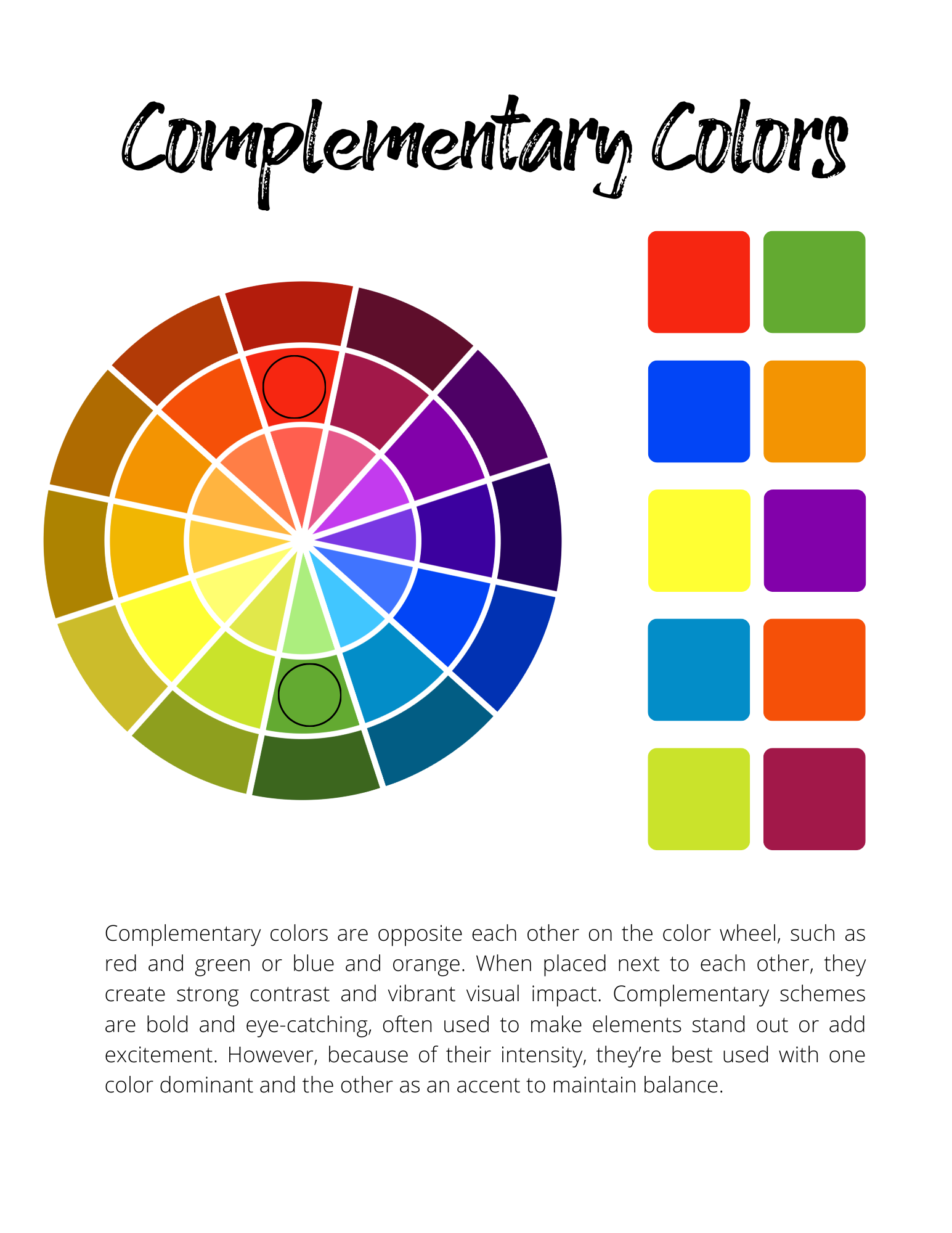
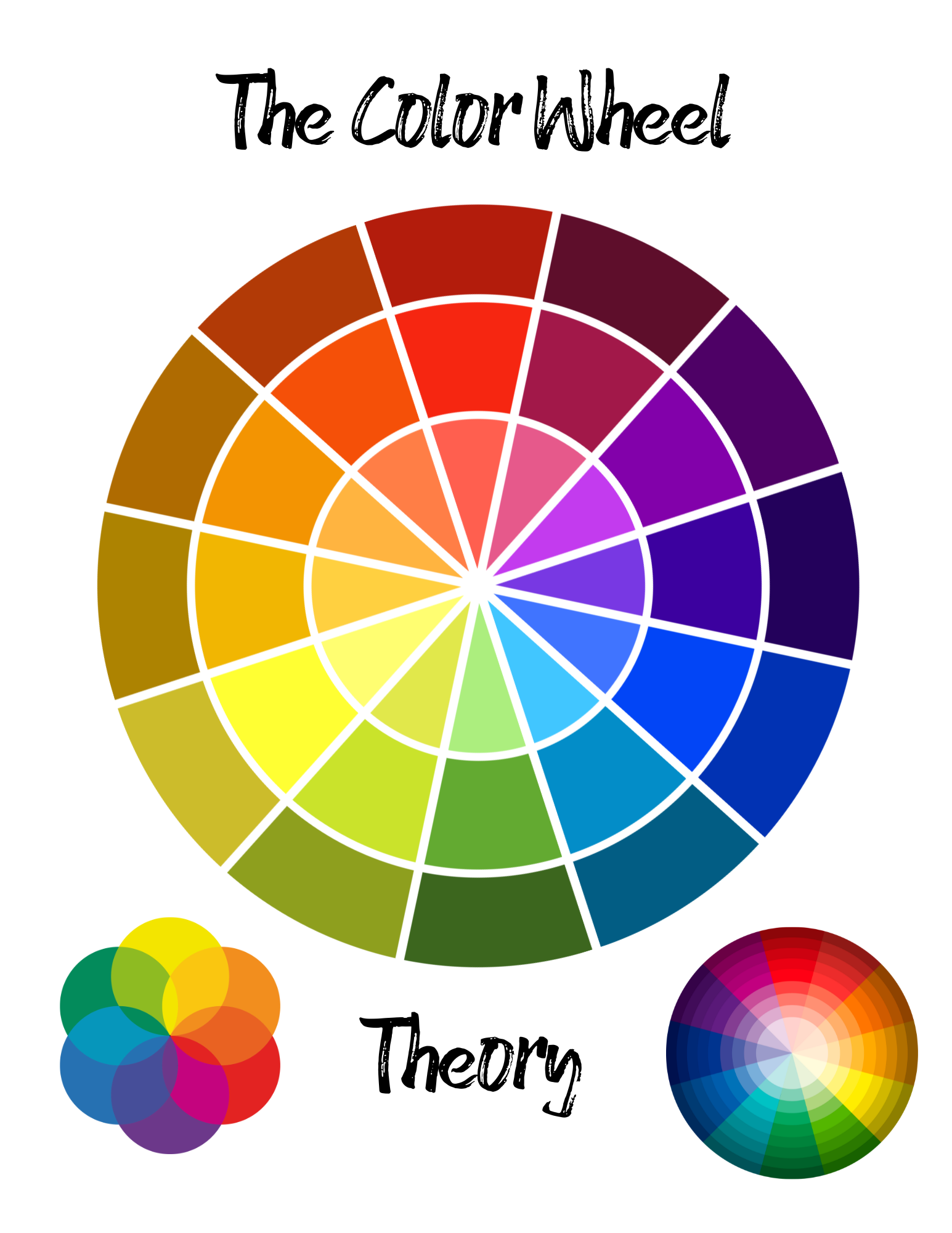
Step 1: Understand the Color Wheel Basics
- Primary Colors: Red, Blue, Yellow — can't be created by mixing.
- Secondary Colors: Orange, Green, Purple — made by mixing two primaries.
- Tertiary Colors: Mix a primary with a secondary (e.g., red + orange = red-orange).
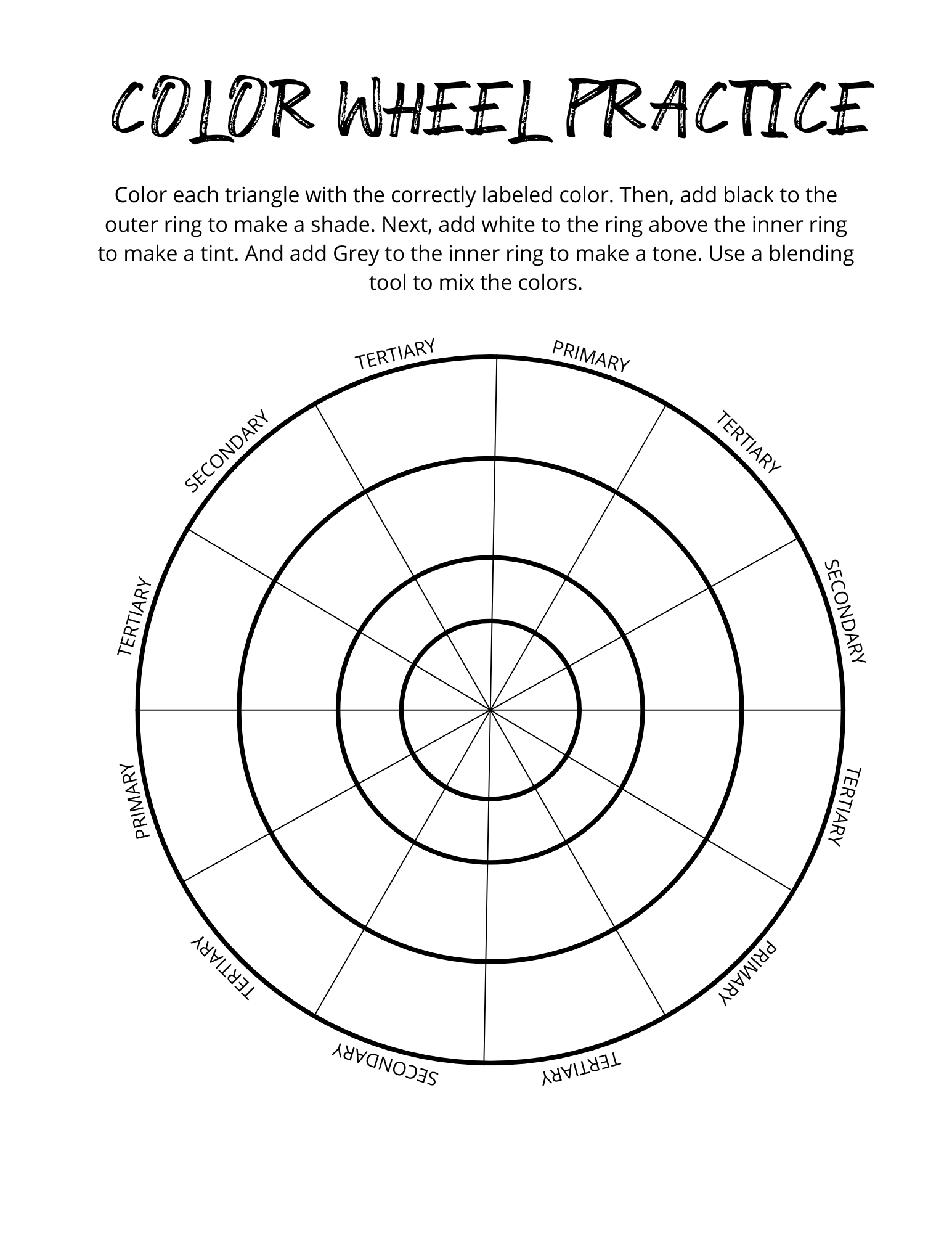
Tip: Print a color wheel or download our free 28-page Color Workbook for quick reference.
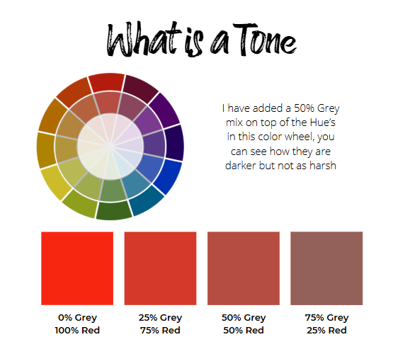
Step 2: Explore Tints, Shades, and Tones
- Tints = Color + White (lighter)
- Shades = Color + Black (darker)
- Tones = Color + Gray (muted)
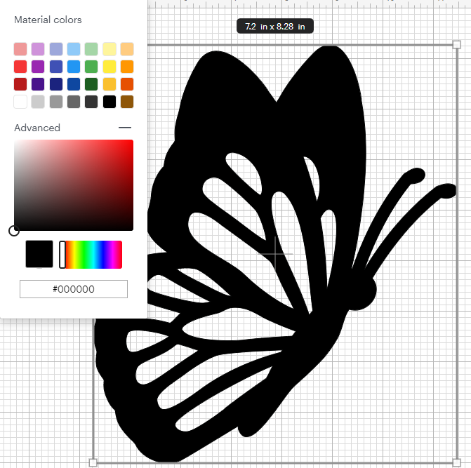
🖌️ In Design Space: Use the Advanced Color Picker to adjust hues by dragging:
- Horizontally = more white
- Vertically = more black
- Diagonally = gray tones
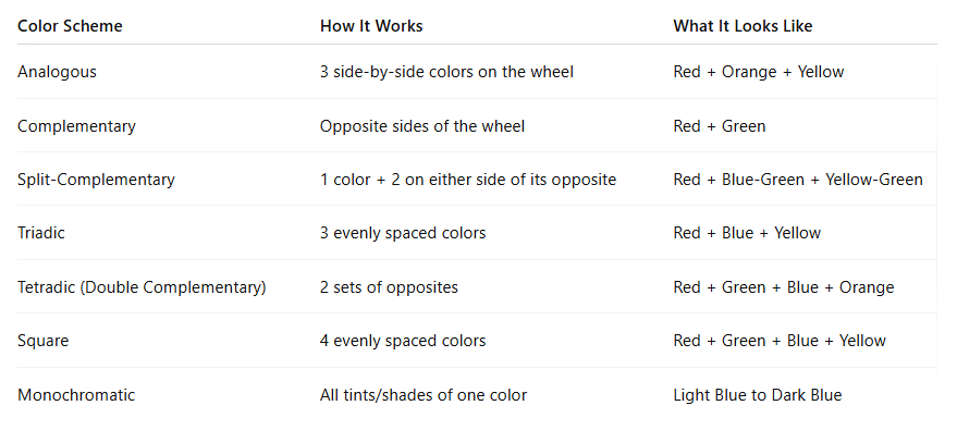
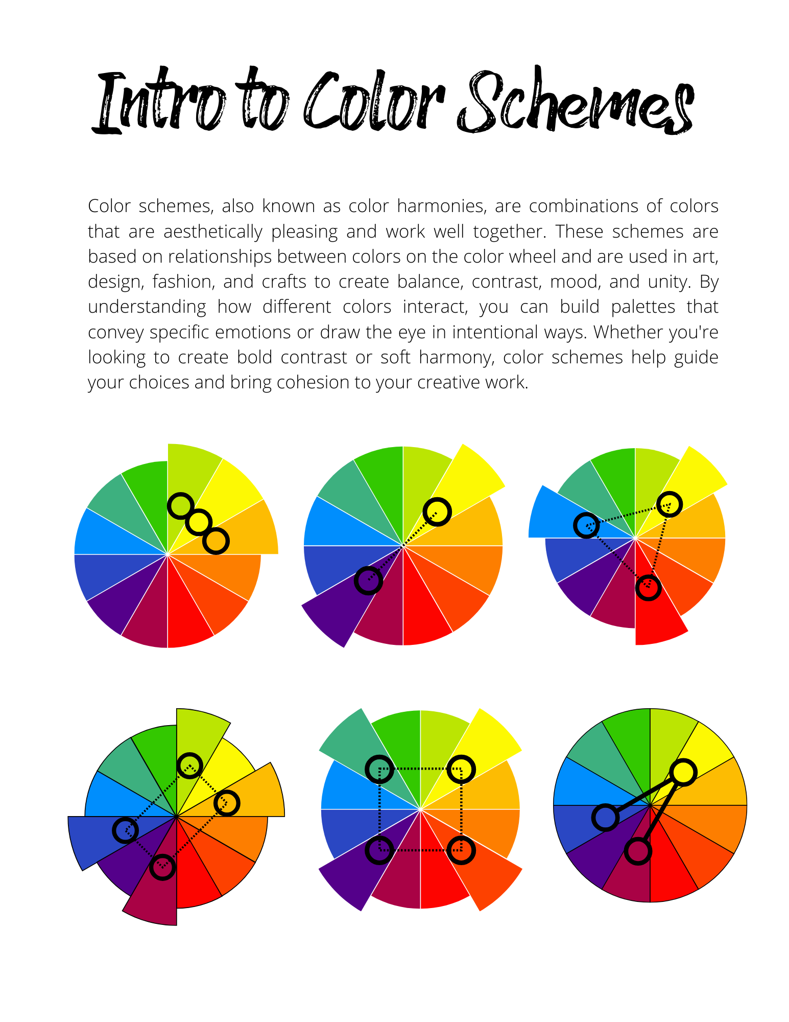
Step 3: Use Color Harmonies for Stunning Combinations
Here are the key schemes you can try:
Step 4: Apply Color in Cricut Design Space
- Open a New Project
- Insert Shapes (Squares or Circles) for experimenting
- Click Fill > Color > Advanced
- Use the hex code or drag within the box to find your desired hue
- Group your shapes by tone to visualize palettes
- Save a Color Sync palette for easy reuse
🎯 Bonus: Use the Color Picker Chrome extension to extract color schemes from images and use the hex codes in Design Space.
Step 5: Choose Color for Print Then Cut Projects
- Use your custom palette to match paper colors to your design
- Flatten layers for printing to retain precise color harmony
- Test shades by holding vinyl or paper up to your screen
🌈 Extra Tips for Color Success
- Stick to 1–2 dominant colors, then add accents
- Use neutral backgrounds (grays, whites) to balance bold hues
- When in doubt, go monochromatic for a sophisticated look
- Print your project preview to test how it will appear physically
💡 Want to Go Deeper?
Download the full Color Wheel Workbook with practice exercises, examples, and print-friendly guides here:
👉 www.bettesmakes.com/color-wheel
🛍️ Final Thoughts
Color can seem intimidating, but with this guide and a little practice, you’ll start designing with confidence and clarity. Your Cricut projects will look more polished and professional—and your creativity will shine through every palette you choose.
#CricutColorGuide, #ColorWheelCrafting, #DesignSpaceTips, #CricutBeginners, #CraftColorTheory, #PrintThenCut, #CricutDesign, #ColorCombinations, #CraftLikeAPro, #CricutProjects
You can grab an Access membership at anytime to use this feature.

3 replies to "🎨 Master the Magic of Color in Cricut Design Space"
When I clicked the link for the color wheel workbook it goes to tool kit. Is that what is needed to get the Color Wheel Workbook or is that not the correct link? Thank you!!
This is the link: bettesmakes.com/color-wheel/
Have fun with your colors/colours!
Thank you so much!!